Case Study | Musketeers iOS
Home
Help Scale
Network Request
Problem
Emergency situations may arise when every second that passes can be extremely critical. A network of qualified responders nearby can provide the immediate attention that is needed.
Objective
A client presented my team and I with a design brief to re-work the Musketeers application that was originally intended for an Israeli audience. The re-design was to focus on the U.S. market and utilize strategies such as crowdsourcing and incentives to build the community and encourage immediacy of response.
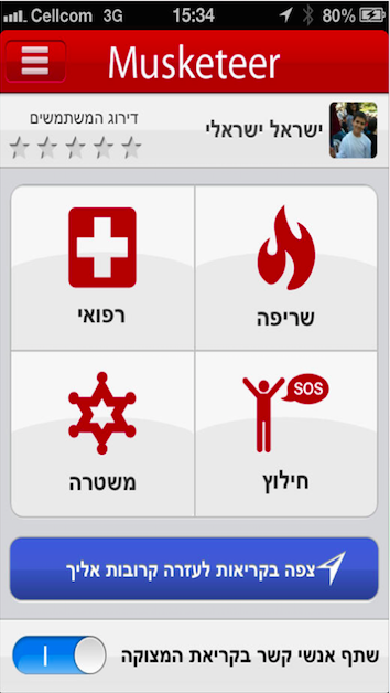
Original Home
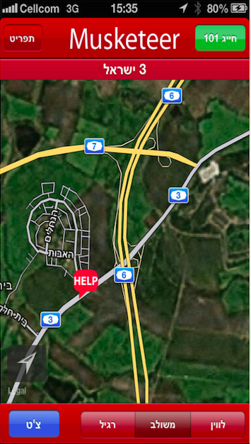
Original GPS map
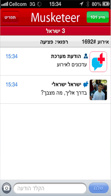
Original Activity Log
The client’s technical goals included:
- Activate help and to identify the need, person, and location
- Identify musketeers nearby and select relevant ones.
- Notify Musketeers/contacts/authorities of the situation
- Enable group collaboration to resolution
- Capture event summary and user rating.
The additional goals as I interpreted:
- Provide a uniform experience across multiple devices so that there is a semantic consistency as an individual takes on different roles within the system.
- Encourage continuous participation– make the experience enjoyable with the use of rewards, incentives and social prestige.
- Create a sense of trust by utilizing both social media and crowdsourcing to help build the community.
- Take advantage of current technology that allows for instant information and connectivity
Understanding the User
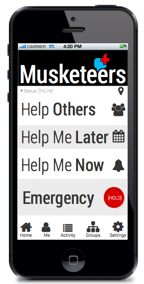
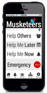
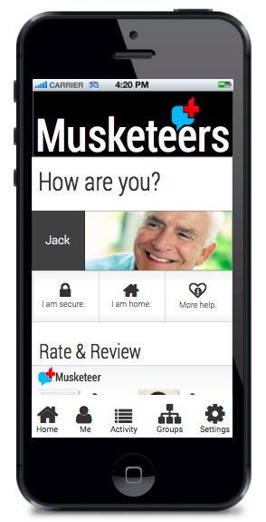
Personas were provided in the brief, user stories and assumptions were then made of how an individual would: (1) need help (2) ask for help (3) respond to help and (4) have the desire to help. By understanding these motivations I was able to recognize the features that were most important to these users and the context to how they’d be using the system. Below is the home screen, which initiates the process, and the task flow for the Help Now user stream.
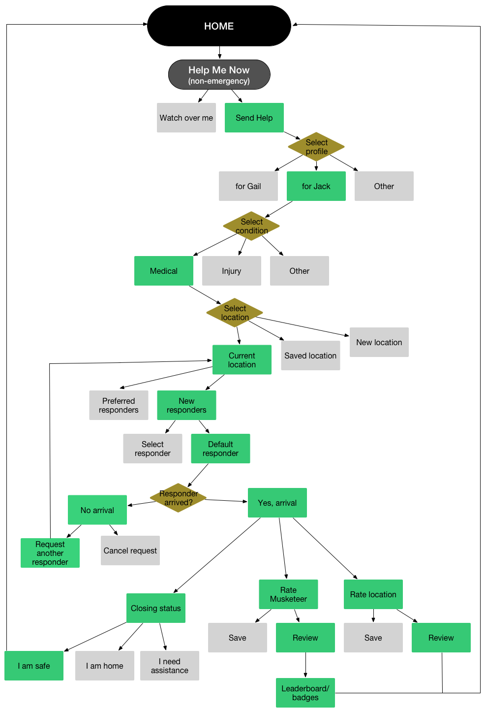
Help Now Task Flow
Concept Sketches
From this scenario I was able to sketch out ideas as to how the the screens would progress. Because of the urgency and timeliness required of the situations I wanted to ensure the design scheme kept the cognitive load to a minimum. I wanted to keep the app’s face very simple and the flow very straightforward so it didn’t require much more thought process.
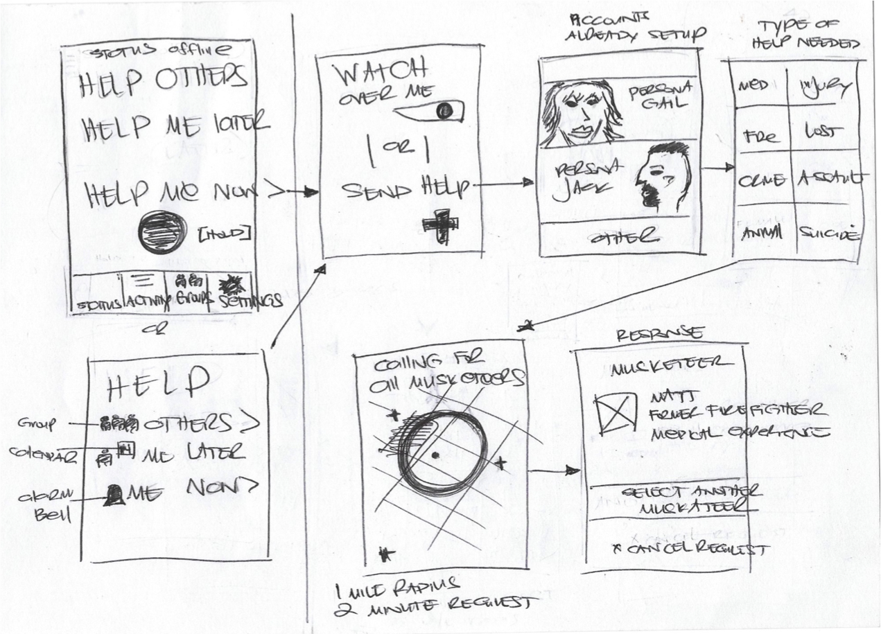
Early Sketches
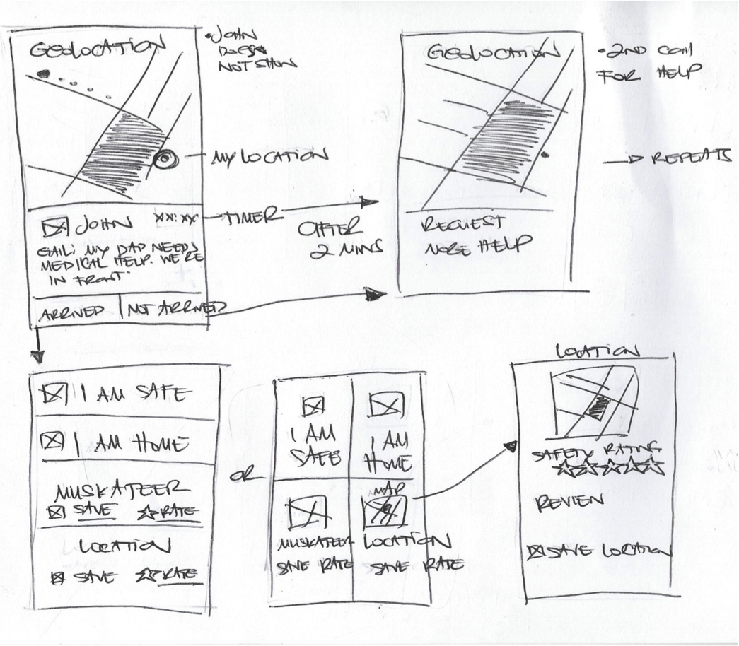
Early Sketches
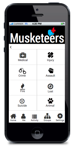
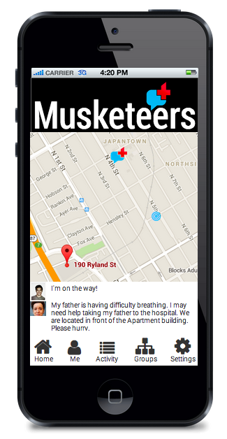
Final Product
Building from the sketches I tried to keep that sense of easy, clean and minimal to the final product. I wanted to ensure that young children and the elderly can easily use the app. The logical basis for my design was:
- Simple grammar for comprehension at all levels
- Large font size for easy readability
- Use of icons for instant recognition
- Color and scale to represent level of urgency
- Images uploaded for familiarity and connection
- Clean interface to reduce clutter and distraction
Help Menu
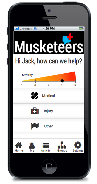
Musketeer response
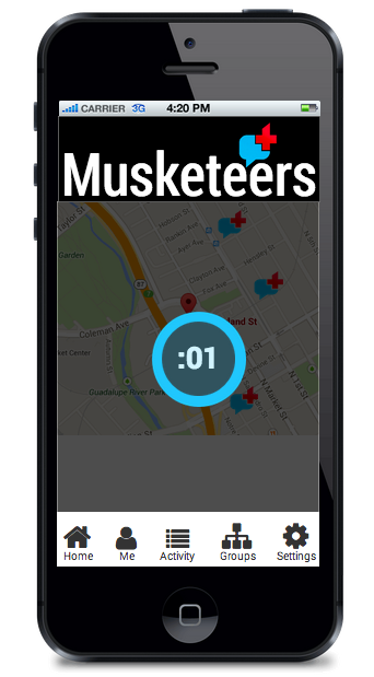
Status report
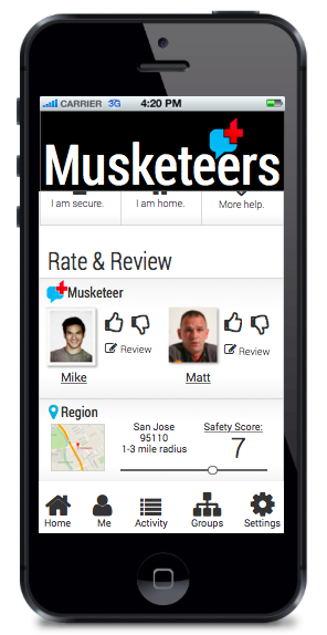
Rate and review